***Note*** By default the field settings has the field disabled for all entries. This can either be turned on for all entries or the editors will need to be set up with the ability to turn it on an entry by entry basis.
Data model and metrics
Use these Favorites field properties in Twig to read favorite totals, current favorite state, display configuration, and text settings. You’ll usually access them from your field handle (for example, entry.favoritesHandle.favoriteCount) and render only the values needed in your template.
Setting
Description
enabled
Whether the favorites widget is enabled for this entry.
id
Aggregate record ID for this entry/field/site context.
elementId
Craft element ID this favorites field belongs to.
fieldId
Craft field ID for this favorites field.
siteId
Site ID for this favorites context.
favoriteCount
Total number of favorites for the entry.
isFavorited
Whether the current user/session has favorited this entry.
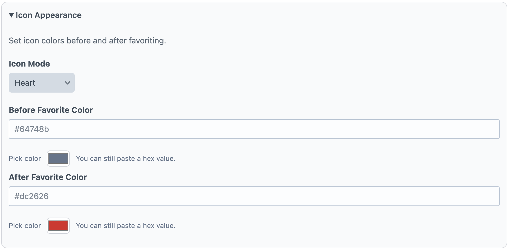
icon
Active icon mode (heart, star, emoji, none, customSvg).
emojiIcon
Emoji used when icon mode is emoji.
beforeFavoriteColor
Background/color value used before the entry is favorited.
afterFavoriteColor
Background/color value used after the entry is favorited.
customSvg
SVG markup used when icon mode is customSvg.
allowGuestInteractions
Whether guests can favorite/unfavorite.
headingText
Optional text shown above the favorites widget.
favoriteText
Optional button text shown before favoriting.
unfavoriteText
Optional button text shown after favoriting (for toggle-off state).
Field settings
The Favorites field settings let you control how the favorite widget looks, behaves, and can be customized by editors. At a high level, you configure visual style (icon mode and colors), interaction rules (guest access), display text, and optional per-entry override permissions for editorial teams.
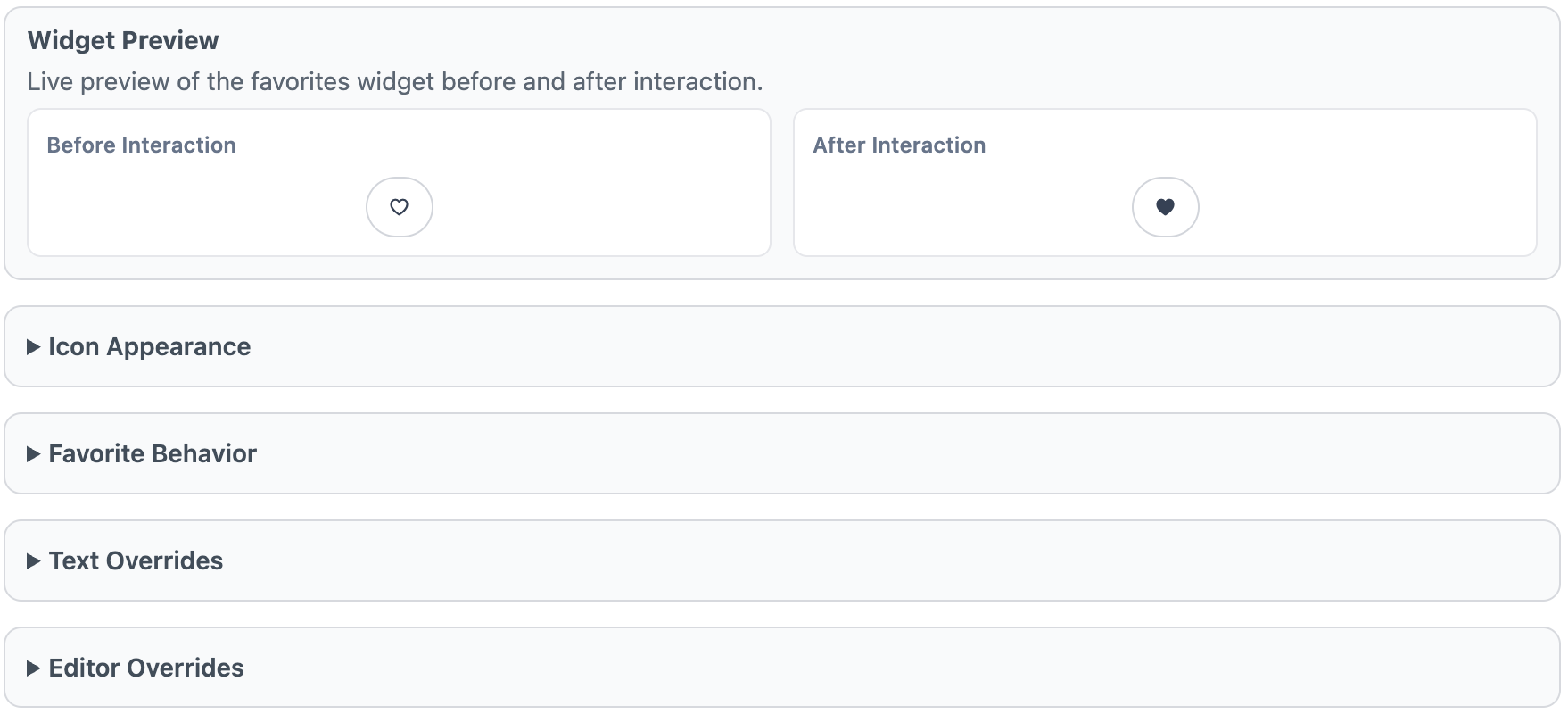
Widget Preview
The Widget Preview shows a live “Before Interaction” and “After Interaction” example so you can quickly validate icon choice, color states, and text settings before saving. It is a visual check only and does not toggle real favorites.
Icon Appearance
Use Icon Appearance to choose how the favorite control is rendered. Icon Mode supports built-in options (heart, star, emoji, none, and custom SVG). If you select Emoji, set the Emoji Icon. If you select Custom SVG, paste SVG markup for the icon. You can also configure before/after favorite color states.
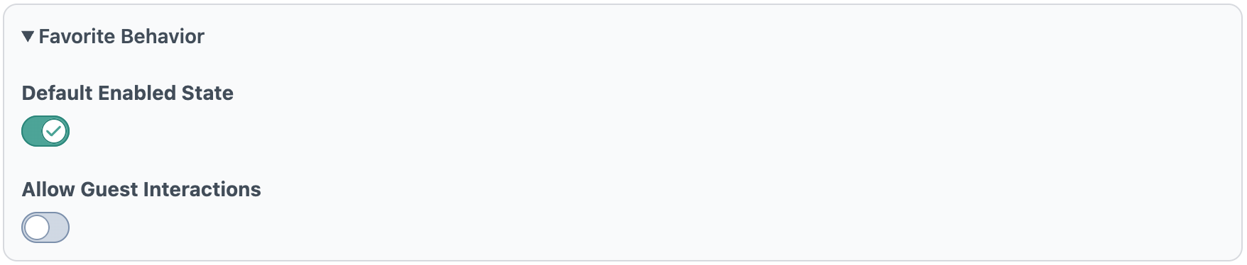
Favorite Behavior
Default Enabled State determines whether new elements start with the widget enabled. Allow Guest Interactions controls whether non-logged-in visitors can favorite/unfavorite entries.
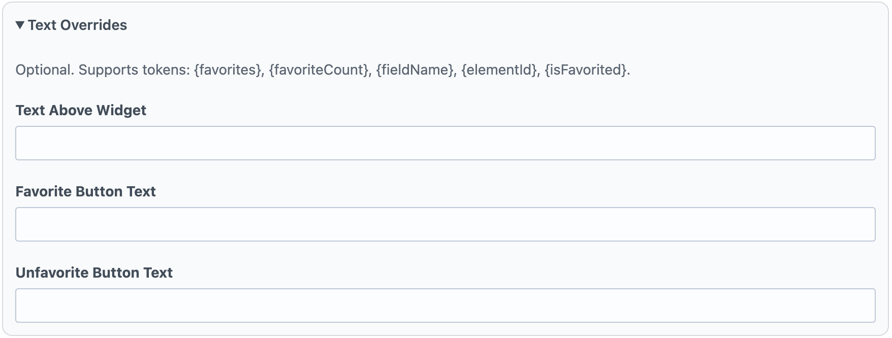
Text Overrides
Text Overrides controls optional messaging around the widget. Text Above Widget appears above the control, while Favorite Button Text and Unfavorite Button Text define button labels for each state. These fields support tokenized values such as favorite counts and current state.
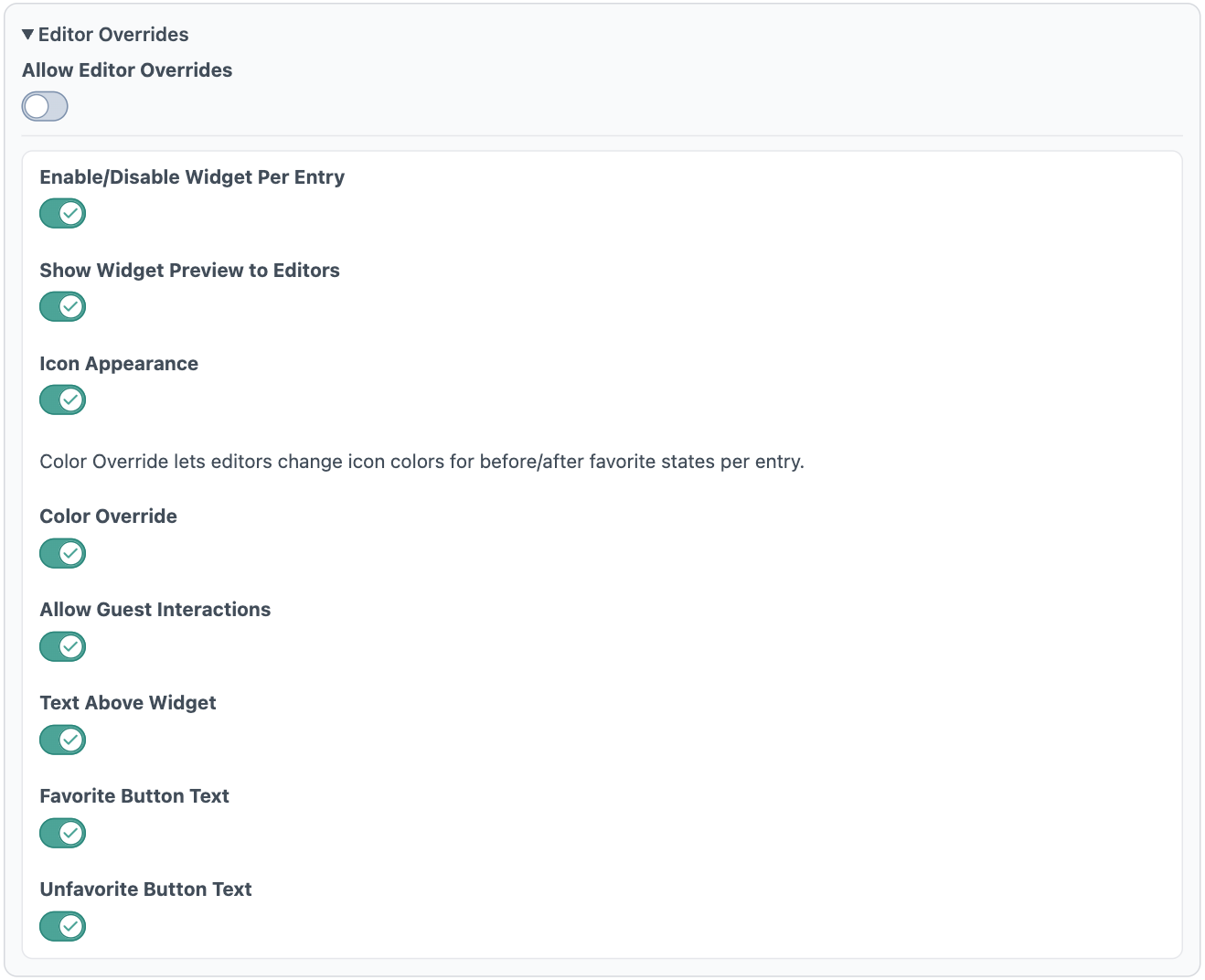
Editor Overrides
Allow Editor Overrides is the master switch for per-entry customization. When enabled, you can grant granular permissions for what editors may change per entry: widget enabled state, preview visibility, icon appearance, icon colors, guest interaction behavior, and text override fields. This keeps defaults consistent while allowing controlled flexibility at the content-entry level.