Try the live rating, likes, and favorites controls below. You can test the basics of how each widget behaves.
☆☆☆☆☆★★★★★
Click to rate
Gives your sites Ratings, Likes/Dislikes, and Favorites fields with flexible guest handling, per-entry editor overrides, and front-end template control.
Overview & Getting Started
Engagement gives Craft CMS sites Ratings, Likes/Dislikes, and Favorites fields. Built to be ready to go from the start or customizable to exactly the needs of your site.
Why buy this plugin
Adds 3 high-impact interaction systems in one install
Works with guests and logged-in users
Gives editors safe per-entry control without developer tickets. You control what your editors control
Know what content your users like and build new pages based on that engagment
Includes moderation and recount tools for confidence at scale
Supports full front-end template overrides when you need complete control over how the widget looks without needing to worry about backend functionality
Documentation & Support
Full technical documentation is available on this site. Need help or something not working as expect, don't hesitate to contact me!
Use the Control Panel moderation area to review and manage activity.
Ratings
Give your site a customizable ratings field
Demo
Default Widget:
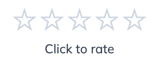
A clean, out-of-the-box 5-star rating widget with “Click to rate” text. You can customize the top and bottom text directly in the Craft Admin Panel (including before/after rating messages), no code required, and optionally allow editors/user groups to manage those same text settings per entry.
☆☆☆☆☆★★★★★
Click to rate
Extended Scale Widget (10-Star Rating) A version of the rating widget that uses a larger scale (for example, 10 instead of 5) so users can give more granular scores. This is configured entirely in Craft field settings, and the same scale/behavior controls can be delegated to editors or specific user groups if you enable the related override permissions.
Widget with a scale of 10
☆☆☆☆☆☆☆☆☆☆★★★★★★★★★★
Click to rate
Icon Style Variations (Stars, Hearts, Emoji) This demo uses the Emoji icon mode only, with an emoji copied from a website or elsewhere and pasted into the Emoji field in Craft. It is a simple no-code way to personalize the widget style in the admin panel, and that same icon/text configuration access can be granted to editors or selected user groups.
Pick any emoji you want
🚡🚡🚡🚡🚡🚡🚡🚡🚡🚡
Or even a custom svg
Data model and metrics
Being a built in field, you can access the properties of the rating for that specific entry anywhere in your templates so you can display the results of your rating field to your users.
Use these Rating field properties in Twig when you need to read current widget configuration, aggregate rating data, or display text/behavior settings in templates. In practice, you’ll usually access them from your field handle (for example, entry.ratingHandle.average) and output only the values you need.
Setting
Description
enabled
Whether the rating widget is enabled for this entry.
id
Aggregate record ID for this entry/field/site context.
elementId
Craft element ID the rating belongs to.
fieldId
Craft field ID for this rating field.
siteId
Site ID for this rating context.
average
Current average rating value.
voteCount
Total number of submitted ratings.
scale
Maximum rating scale (for example, 5).
icon
Active icon mode (star, heart, thumbs, emoji, customSvg).
emojiIcon
Emoji character used when icon mode is emoji.
customSvg
SVG markup used when icon mode is customSvg.
allowGuestRatings
Whether guests are allowed to submit ratings.
allowUserRatingChange
Whether users can change an existing rating.
headingText
Optional text shown above the rating widget.
clickToRateText
Text shown before the current user has rated.
yourRatingText
Text shown after the current user has rated.
percentage
Computed value: average converted to a 0–100 percentage.
roundedAverage
Computed value: average rounded to one decimal place.
Field settings and Customization
The Rating field settings let you control how ratings look, behave, and can be customized by editors. At a high level, you configure the visual style (icon mode and scale), interaction rules (guest access and whether users can change ratings), display text, and optional per-entry override permissions for editorial teams.
Widget Preview
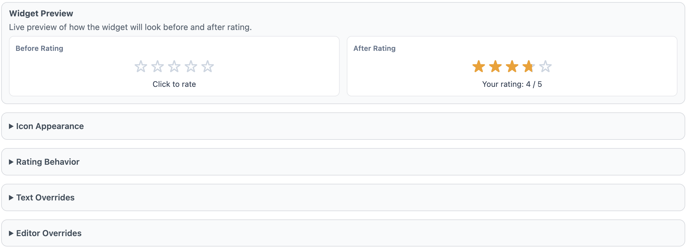
The Widget Preview shows a live “Before Rating” and “After Rating” example so you can quickly validate your icon choice, scale, and text settings before saving. It is a visual check only and does not save or cast real ratings.
Icon Appearance
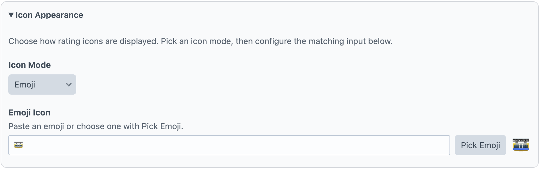
Use Icon Appearance to choose how each rating step is rendered. Icon Mode supports built-in options (such as star, heart, thumbs, emoji, and custom SVG). If you select Emoji, set the Emoji Icon. If you select Custom SVG, paste one SVG icon in Custom SVG Markup; the widget repeats that icon across the configured scale.
Rating Behavior
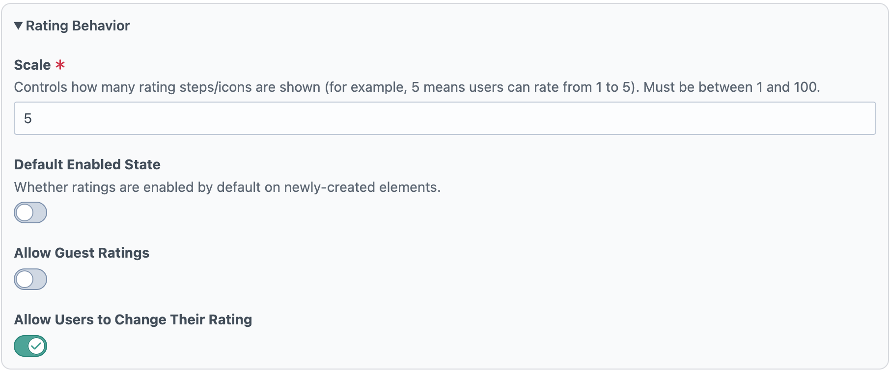
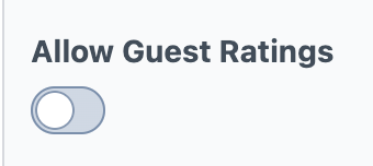
Scale controls the number of rating steps shown (for example, 5 creates a 1–5 rating). Default Enabled State determines whether new elements start with the widget enabled. Allow Guest Ratings controls whether non-logged-in visitors can rate. Allow Users to Change Their Rating controls whether a user can update a previously submitted rating.
Text Overrides
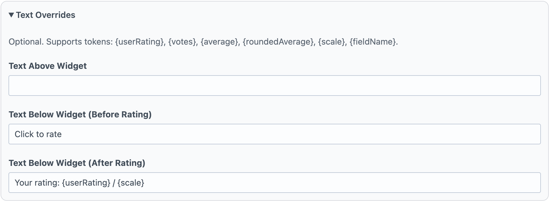
Text Overrides controls the optional messages around the widget. Text Above Widget appears above the icons, Text Below Widget (Before Rating) appears when no user rating exists yet, and Text Below Widget (After Rating) appears after a rating is submitted. These fields support rating tokens such as user rating, vote count, and average values.
Editor Overrides
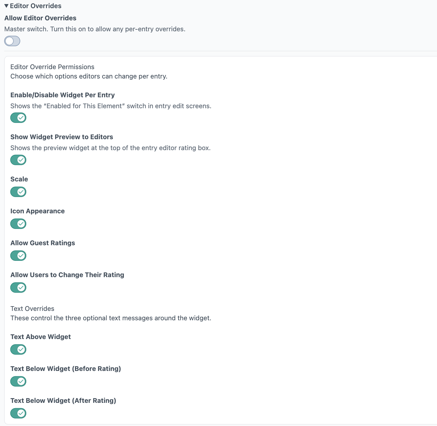
Allow Editor Overrides is the master switch for per-entry customization. When enabled, you can grant granular permissions for what editors may change per entry: widget enabled state, preview visibility, scale, icon appearance, guest-rating behavior, user rating-change behavior, and each text override field. This lets developers keep defaults centralized while allowing controlled flexibility at the content-entry level.
Template Overrides
Engagement’s Ratings, Likes/Dislikes, and Favorites widgets are fully customizable. For each widget type, you can override the Twig/HTML, CSS, and JavaScript independently, either site-wide or per template/render call, so you can keep a global default while tailoring specific experiences where needed. Full template override details are available here: Template Overrides Documentation.
Likes/Dislikes
Demo
Default Widget: A clean, out-of-the-box Like/Dislike widget with clear thumbs controls. You can customize the text directly in the Craft Admin Panel (including heading and button labels), no code required, and optionally allow editors/user groups to manage those same text settings per entry.
Emoji Icon Variation (Pasted Emoji): This demo uses Emoji icon mode, with emoji copied from a website or elsewhere and pasted into the Like Emoji and Dislike Emoji fields in Craft. You can also It is a simple no-code way to personalize the widget style in the admin panel, and that same icon/text configuration access can be granted to editors or selected user groups.
Put whatever your heart desires here
Data model and metrics
Field settings and Customization
The Likes/Dislikes field settings let you control how the widget looks, behaves, and can be customized by editors. At a high level, you configure the visual style (icon mode and state colors), interaction rules (guest access and whether users can change votes), display text, and optional per-entry override permissions for editorial teams.
Widget Preview
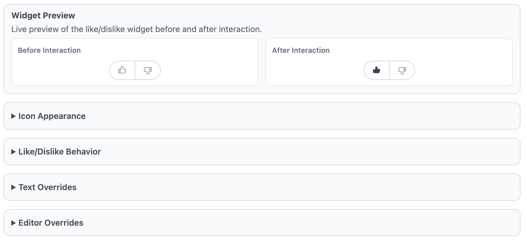
The Widget Preview shows a live “Before Interaction” and “After Interaction” example so you can quickly validate icon style, color states, and text settings before saving. It is a visual check only and does not cast real likes/dislikes.
Icon Appearance
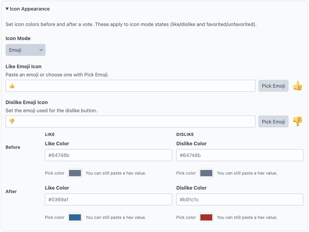
Use Icon Appearance to choose how like/dislike buttons are rendered. Icon Mode supports built-in options (thumbs, emoji, none, and custom SVG). If you select Emoji, set both Like Emoji Icon and Dislike Emoji Icon. If you select Custom SVG, provide SVG markup for both the like and dislike icons. You can also define before/after color states for both buttons.
Like/Dislike Behavior
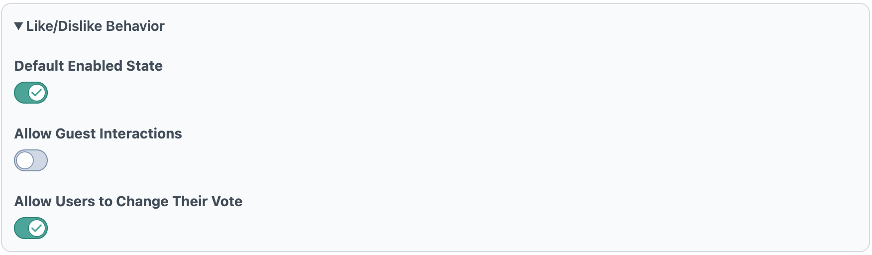
Default Enabled State determines whether new elements start with the widget enabled. Allow Guest Interactions controls whether non-logged-in visitors can like/dislike. Allow Users to Change Their Vote controls whether users can switch vote direction or remove their vote after interacting.
Text Overrides
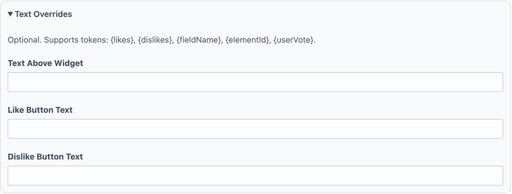
Text Overrides controls optional messaging around the widget. Text Above Widget appears above the control, while Like Button Text and Dislike Button Text define button labels. These fields support tokenized values such as counts and vote state.
Editor Overrides
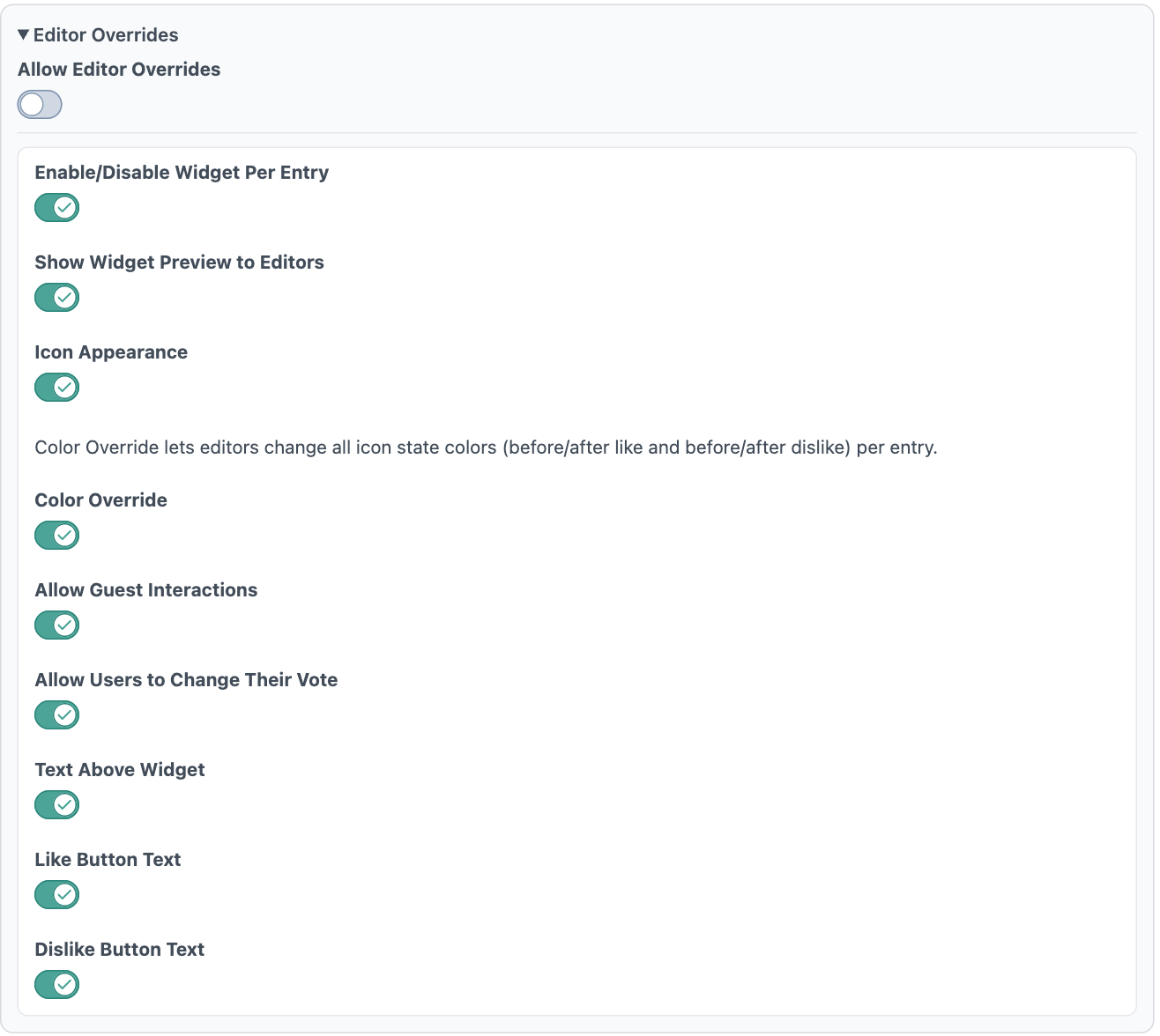
Allow Editor Overrides is the master switch for per-entry customization. When enabled, you can grant granular permissions for what editors may change per entry: widget enabled state, preview visibility, icon appearance, icon colors, guest interaction behavior, vote-change behavior, and text override fields. This keeps defaults consistent while allowing controlled flexibility at the content-entry level.
Template Overrides
Engagement’s Ratings, Likes/Dislikes, and Favorites widgets are fully customizable. For each widget type, you can override the Twig/HTML, CSS, and JavaScript independently, either site-wide or per template/render call, so you can keep a global default while tailoring specific experiences where needed. Full template override details are available here: Template Overrides Documentation.
Favorites
Demo
Default Widget: A clean, out-of-the-box Favorites widget with a simple toggle interaction. You can customize the text directly in the Craft Admin Panel (including heading and button text for favorite/unfavorite states), no code required, and optionally allow editors/user groups to manage those same text settings per entry.
Favorites Customization Options: You can customize the Favorites widget entirely in Craft field settings, including icon mode, emoji icon (including pasted emoji), custom SVG icon, before/after favorite colors, guest interaction behavior, and top/bottom text behavior. Like the other widget types, these settings can remain admin-only or be selectively granted to editors and specific user groups through override permissions.
Data model and metrics
Use these Favorites field properties in Twig to read favorite totals, current favorite state, display configuration, and text settings. You’ll usually access them from your field handle (for example, entry.favoritesHandle.favoriteCount) and render only the values needed in your template.
Setting
Description
enabled
Whether the favorites widget is enabled for this entry.
id
Aggregate record ID for this entry/field/site context.
elementId
Craft element ID this favorites field belongs to.
fieldId
Craft field ID for this favorites field.
siteId
Site ID for this favorites context.
favoriteCount
Total number of favorites for the entry.
isFavorited
Whether the current user/session has favorited this entry.
icon
Active icon mode (heart, star, emoji, none, customSvg).
emojiIcon
Emoji used when icon mode is emoji.
beforeFavoriteColor
Background/color value used before the entry is favorited.
afterFavoriteColor
Background/color value used after the entry is favorited.
customSvg
SVG markup used when icon mode is customSvg.
allowGuestInteractions
Whether guests can favorite/unfavorite.
headingText
Optional text shown above the favorites widget.
favoriteText
Optional button text shown before favoriting.
unfavoriteText
Optional button text shown after favoriting (for toggle-off state).
Field settings
The Favorites field settings let you control how the favorite widget looks, behaves, and can be customized by editors. At a high level, you configure visual style (icon mode and colors), interaction rules (guest access), display text, and optional per-entry override permissions for editorial teams.
Widget Preview
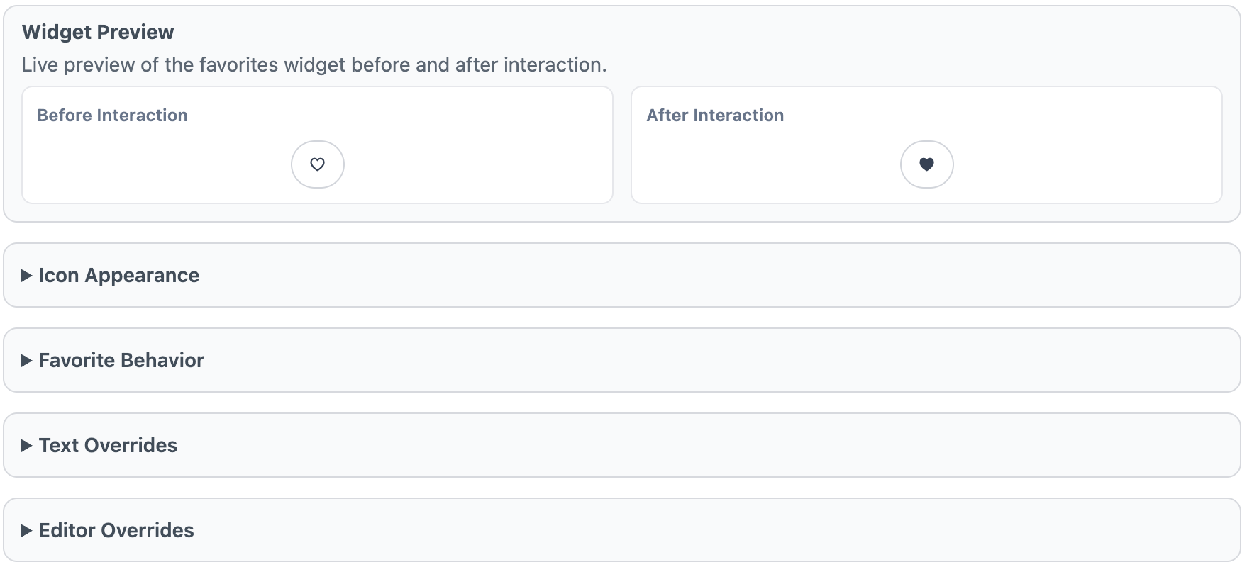
The Widget Preview shows a live “Before Interaction” and “After Interaction” example so you can quickly validate icon choice, color states, and text settings before saving. It is a visual check only and does not toggle real favorites.
Icon Appearance
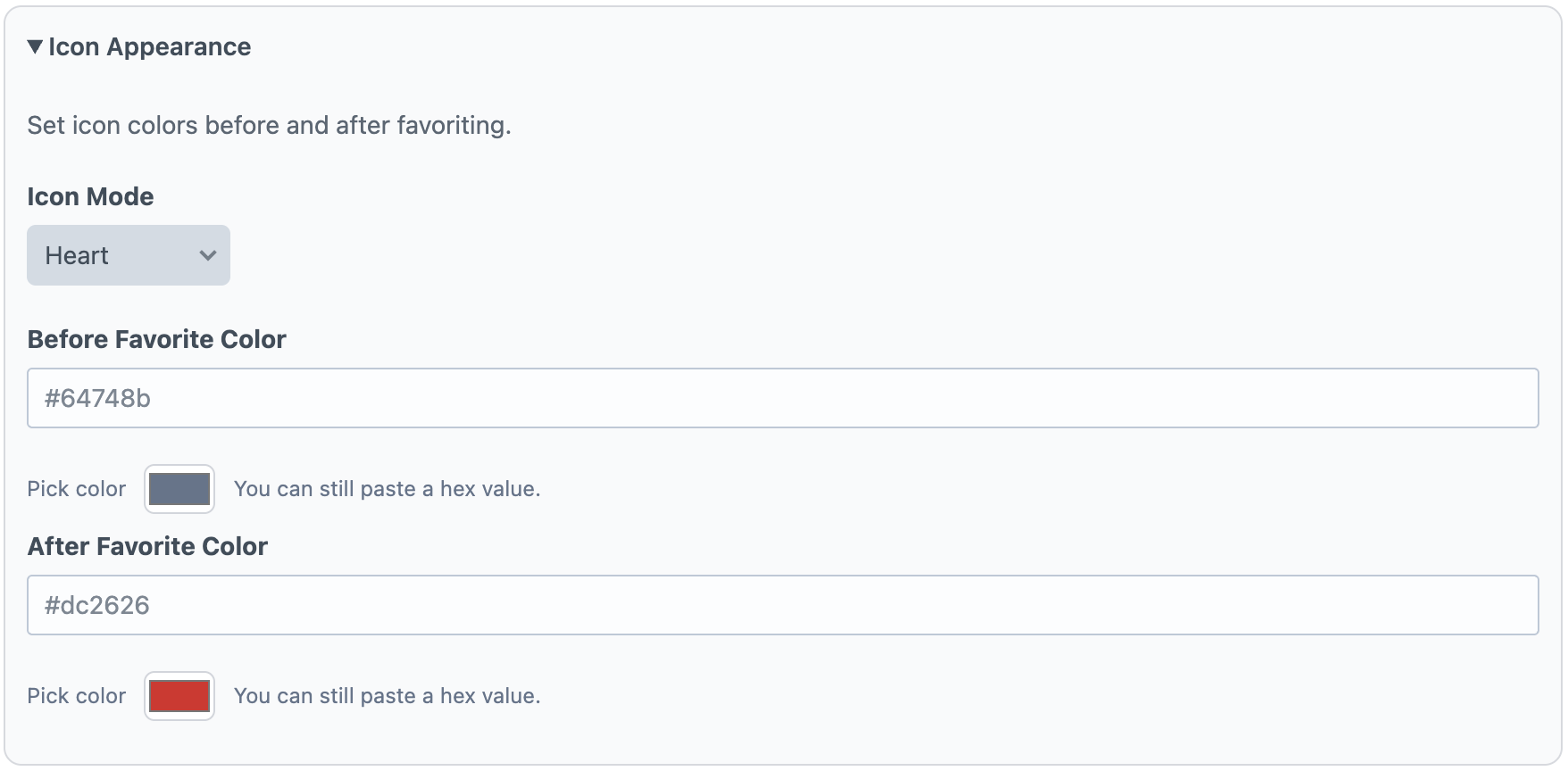
Use Icon Appearance to choose how the favorite control is rendered. Icon Mode supports built-in options (heart, star, emoji, none, and custom SVG). If you select Emoji, set the Emoji Icon. If you select Custom SVG, paste SVG markup for the icon. You can also configure before/after favorite color states.
Favorite Behavior
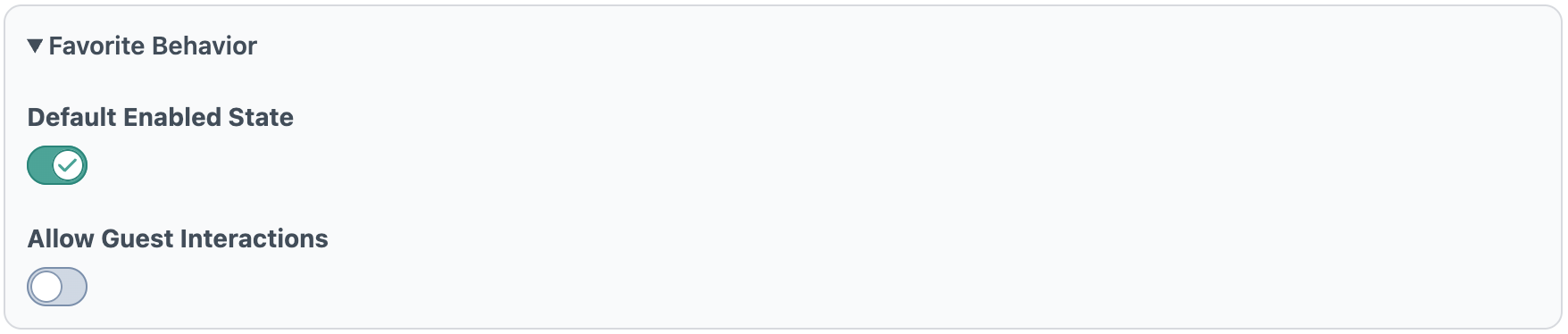
Default Enabled State determines whether new elements start with the widget enabled. Allow Guest Interactions controls whether non-logged-in visitors can favorite/unfavorite entries.
Text Overrides
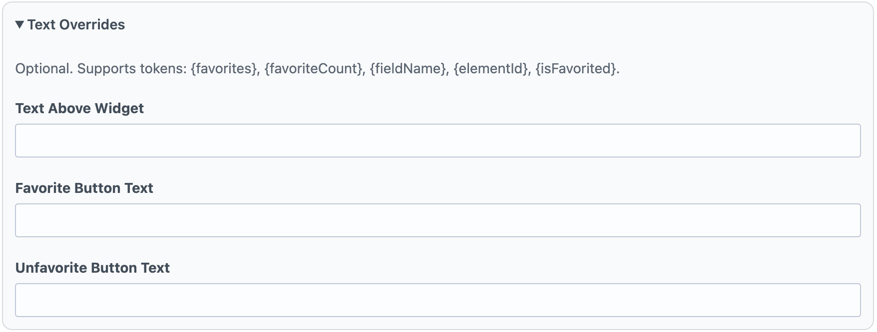
Text Overrides controls optional messaging around the widget. Text Above Widget appears above the control, while Favorite Button Text and Unfavorite Button Text define button labels for each state. These fields support tokenized values such as favorite counts and current state.
Editor Overrides
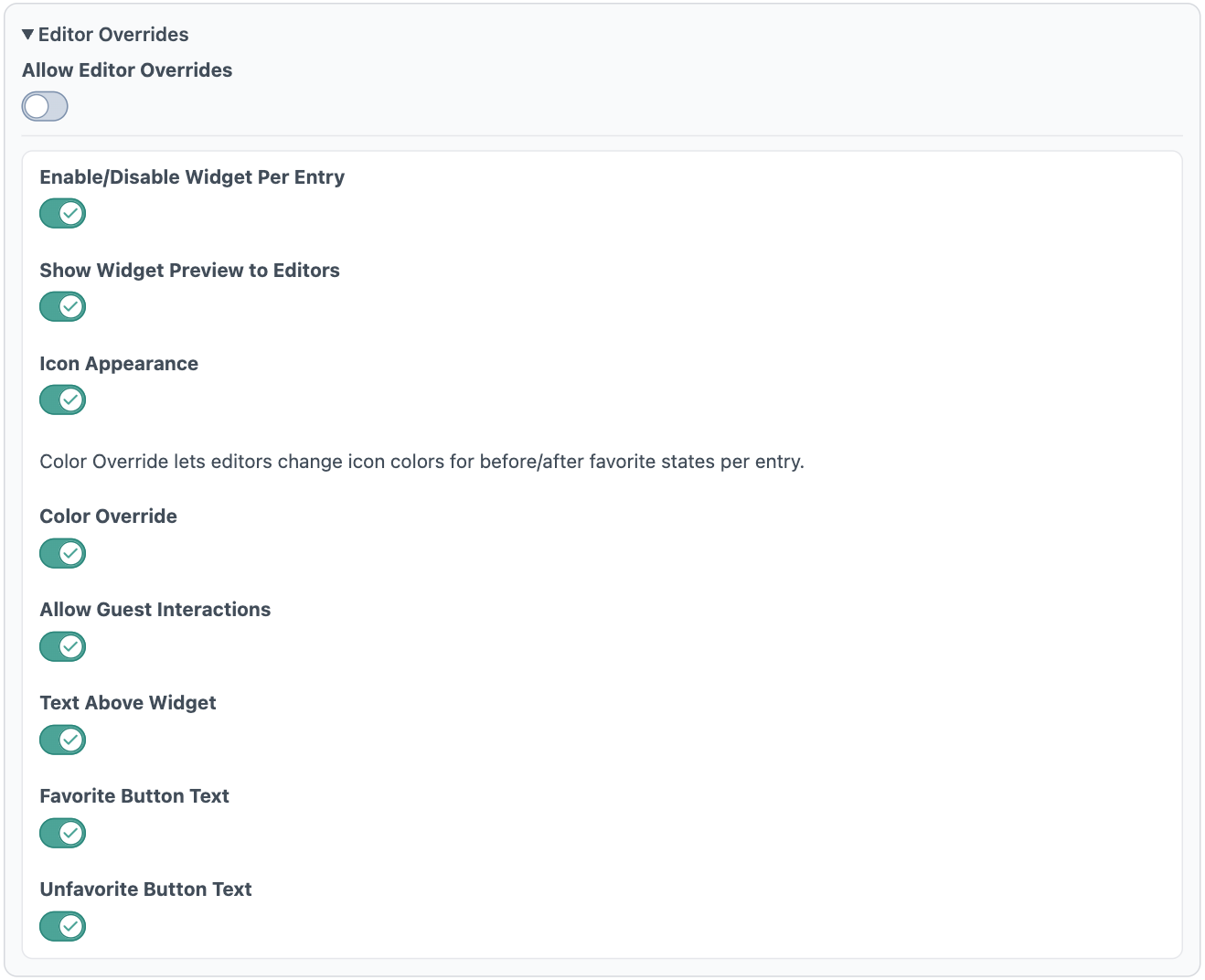
Allow Editor Overrides is the master switch for per-entry customization. When enabled, you can grant granular permissions for what editors may change per entry: widget enabled state, preview visibility, icon appearance, icon colors, guest interaction behavior, and text override fields. This keeps defaults consistent while allowing controlled flexibility at the content-entry level.
Template Overrides
Engagement’s Ratings, Likes/Dislikes, and Favorites widgets are fully customizable. For each widget type, you can override the Twig/HTML, CSS, and JavaScript independently, either site-wide or per template/render call, so you can keep a global default while tailoring specific experiences where needed. Full template override details are available here: Template Overrides Documentation.
Moderation
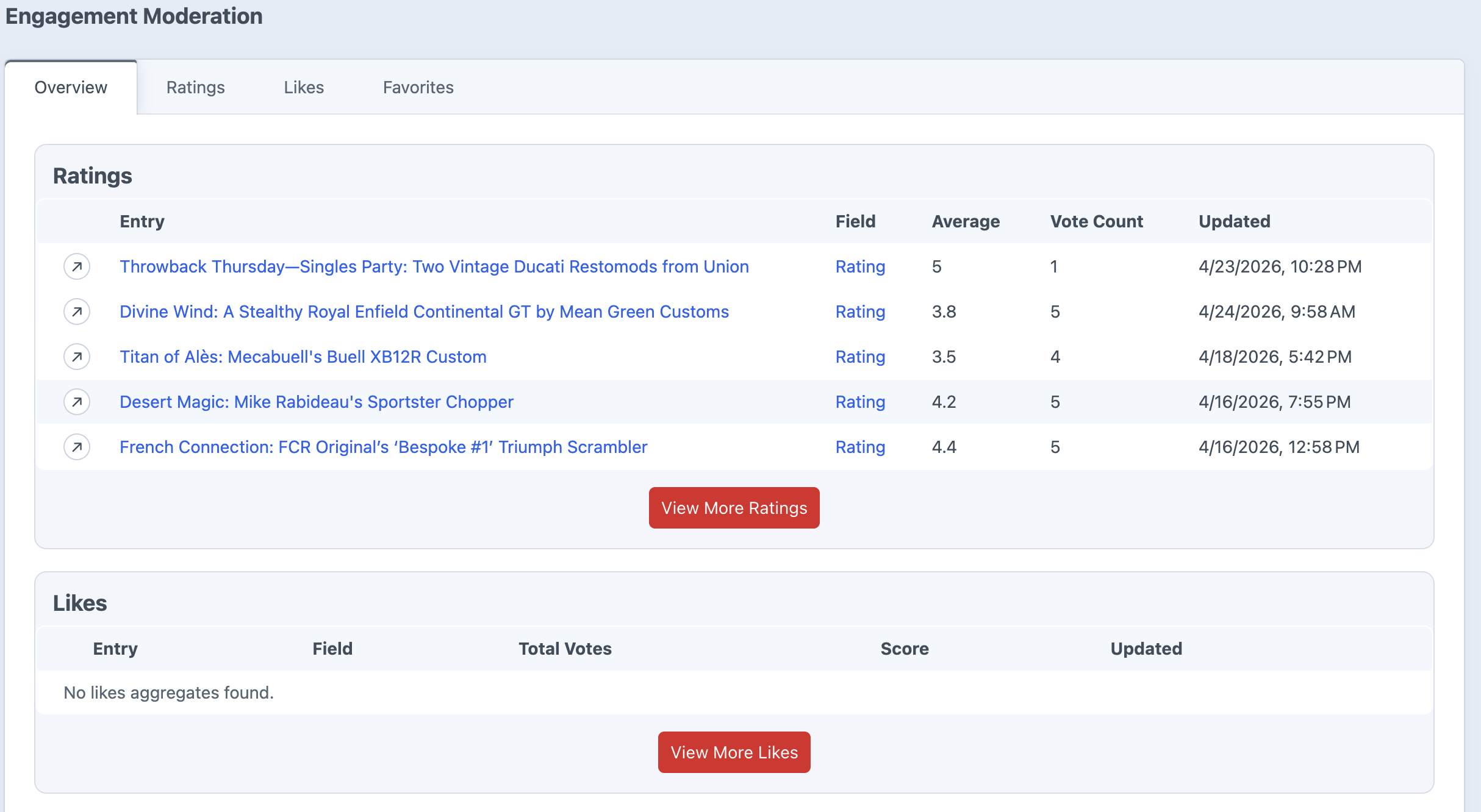
The Engagement moderation area gives you a control panel view of rating, like/dislike, and favorite activity across your site. Use it to see which entries are getting interaction, inspect individual votes, and clean up activity when needed.
Overview
The overview screen shows recent activity across all three engagement types:
Ratings: See entries with rating activity, average rating, and vote count.
Likes/Dislikes: See like totals, dislike totals, total votes, and score.
Favorites: See entries with favorite activity and favorite counts.
Filtering and Sorting
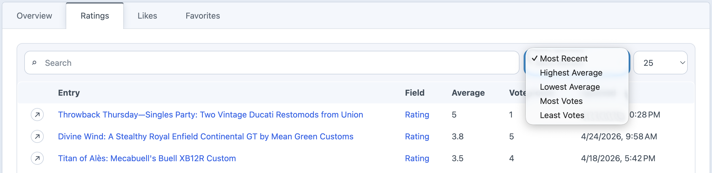
Each moderation tab includes search, sorting, and pagination controls so you can find the entries that need attention.
Ratings can be sorted by most recent, highest average, lowest average, most votes, or least votes.
Likes/Dislikes can be sorted by score, total votes, likes, dislikes, or most recent.
Favorites can be sorted by most recent, most favorites, or least favorites.
Activity Details
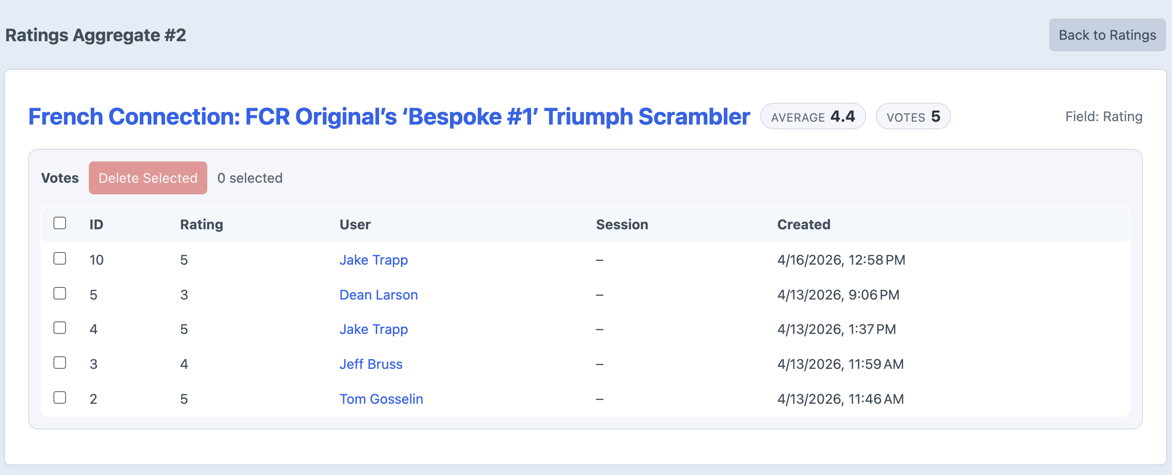
Open an aggregate row to view the individual activity behind it. Detail pages show the entry, field, totals, and individual rows for each interaction.
For ratings and likes/dislikes, you can see the individual vote value, user, session ID, and created date. For favorites, you can see who favorited the entry, their session ID, and when it happened.
Users and Guests
Logged-in activity links back to the Craft user when available. Guest activity is labeled as Guest and includes the session ID used to track the interaction.
This makes moderation useful for both member-only and guest-enabled interaction setups.
Deleting Activity
On detail pages, you can select individual rows and delete them. After rows are deleted, Engagement recounts the aggregate totals so the entry’s rating, like/dislike, or favorite count stays accurate.
Recount Tools
If aggregate totals ever need to be rebuilt, Engagement also includes console recount commands for ratings, likes/dislikes, and favorites. The main use case for this would be if something got corrupted in the database. Not something that should be needed ever, but there if needed.
You can also recount a single aggregate by passing its ID instead of using --all.
Guest & User Interaction Behavior
Guest & User Interaction
Engagement lets you decide what happens when logged-out visitors try to rate, like, dislike, or favorite content. When guest mode is enabled anyone is allowed to cast a vote. The Plugin uses session id to store the users behavior to prevent duplicate votes
Global Guest Settings
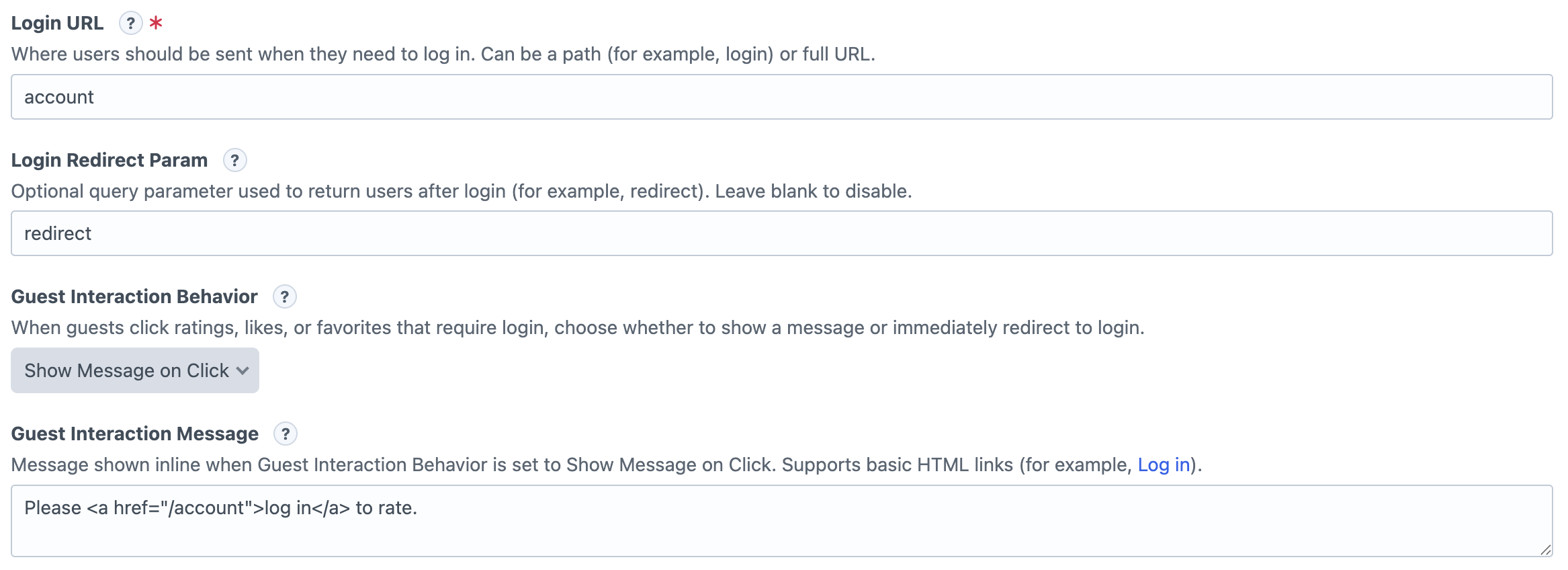
These settings live in the Engagement plugin settings page and apply whenever a guest is not allowed to interact with a widget.
Login URL: Where guests are sent when they need to log in.
Login Redirect Param: Optional query parameter used to send users back to the page they came from after login.
Guest Interaction Behavior:
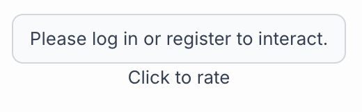
Show Message On Click: The widget will display the 'Guest Interaction Message' to the user when they try to interact, prompting them to login
Auto Redirect to login:
Guest Interaction Message: The message shown when behavior is set to “Show Message on Click.” Basic links are supported.
Field Guest Settings
Each field also decides whether guests are allowed to interact at all.
Ratings: Use Allow Guest Ratings.
Likes/Dislikes: Use Allow Guest Interactions.
Favorites: Use Allow Guest Interactions.
User Change Settings
Ratings and Likes/Dislikes can also control whether users are allowed to change their choice later.
Ratings:Allow Users to Change Their Rating
Likes/Dislikes:Allow Users to Change Their Vote
How It Works
If guests are allowed, they can interact normally. If guests are not allowed, Engagement uses the global setting: show a message or redirect them to the login URL.
Querying
Querying Entries with Engagement
Engagement lets you query entries by Rating, Likes/Dislikes, and Favorites metrics directly from your field handle on an element query. This keeps queries Craft-native and easy to compose with other entry filters.
Each Engagement field handle accepts a criteria object. You can combine Engagement criteria with normal Craft query methods like section, site, orderBy, limit, and relatedTo.